REFRESH FOR CONSUMER & ENTERPRISE (AQUIRED BY LINKEDIN)
Headed design and research for Refresh, an Android/iOS, Salesforce and web application that helped business professionals get the most out of every conversation. Refresh delivered the most relevant insights to help you better connect with people when you meet.
ROLE: Head of User Experience (Research & Design) aka Senior Designer
DURATION: 1 Year, 2 Months
TEAM: 3 Designers, CEO, CTO, Head of Product, Marketing Lead, 4 Front-end and 10 Back-end engineers
PLATFORMS: iOS, Consumer Web, Salesforce Plug-In
LINKS: INSIGHTS GUIDE, LINKEDIN ACQUISITION, MY SAMPLE REFRESH DOSSIER
I joined Refresh as their 7th hire. They had a fantastic UI design contractor who was helping them work through surface level issues with the application, but they were looking to hire someone to help rethink the way the application functions at its core. While the goal of the product was to foster more authentic conversations, many users had trouble getting past the privacy concerns around logging into all their email, contacts, and social media accounts to help the app better understand their connection to the people they were about to meet. When I joined, I knew I faced many challenges but the app had tremendous potential. I was eager to conduct user research to help narrow down the market and understand its needs before embarking on a major redesign. Aside from designing for the market, I was also laser focused on how we can make insights timely, informative and delightful.
I led and owned the user experience for the app across all platforms and managed 2 UI/UX designers. The team redesigned Refresh from the ground up. It wasn't always easy and we definitely didn't always see eye-to-eye, but we valued the expertise each individual brought to the table and managed to find a path forward even through difficult times. The app is used as an example in Nir Eyal’s workshop on Hook Theory and was featured on the iOS App Store five times.
This was probably one of the strongest groups of people I've ever worked with. I truly hope to get a chance to work with these folks again, and if that doesn't happen, I hope to see them accomplish great things in the world.
Empathize
As soon as I joined, I attended Dreamforce 2013 to conduct research on the existing app with both active and first-time users. This helped highlight what existing users loved and hated about the app, as well as features that would augment their experience. I was also able to understand what the barriers to entry were for new users, their initial thoughts on the insights Refresh provided and whether they found the app useful/sticky enough to use again. I was excited to share the learnings with the rest of the team and kick off brainstorms to redesign the app. Once the initial redesign was complete, I continued to gather insights from research and existing users to ensure we continued to meet their needs. I also looked to parallel technology and the latest mobile design trends for inspiration.
Interpret
& Define
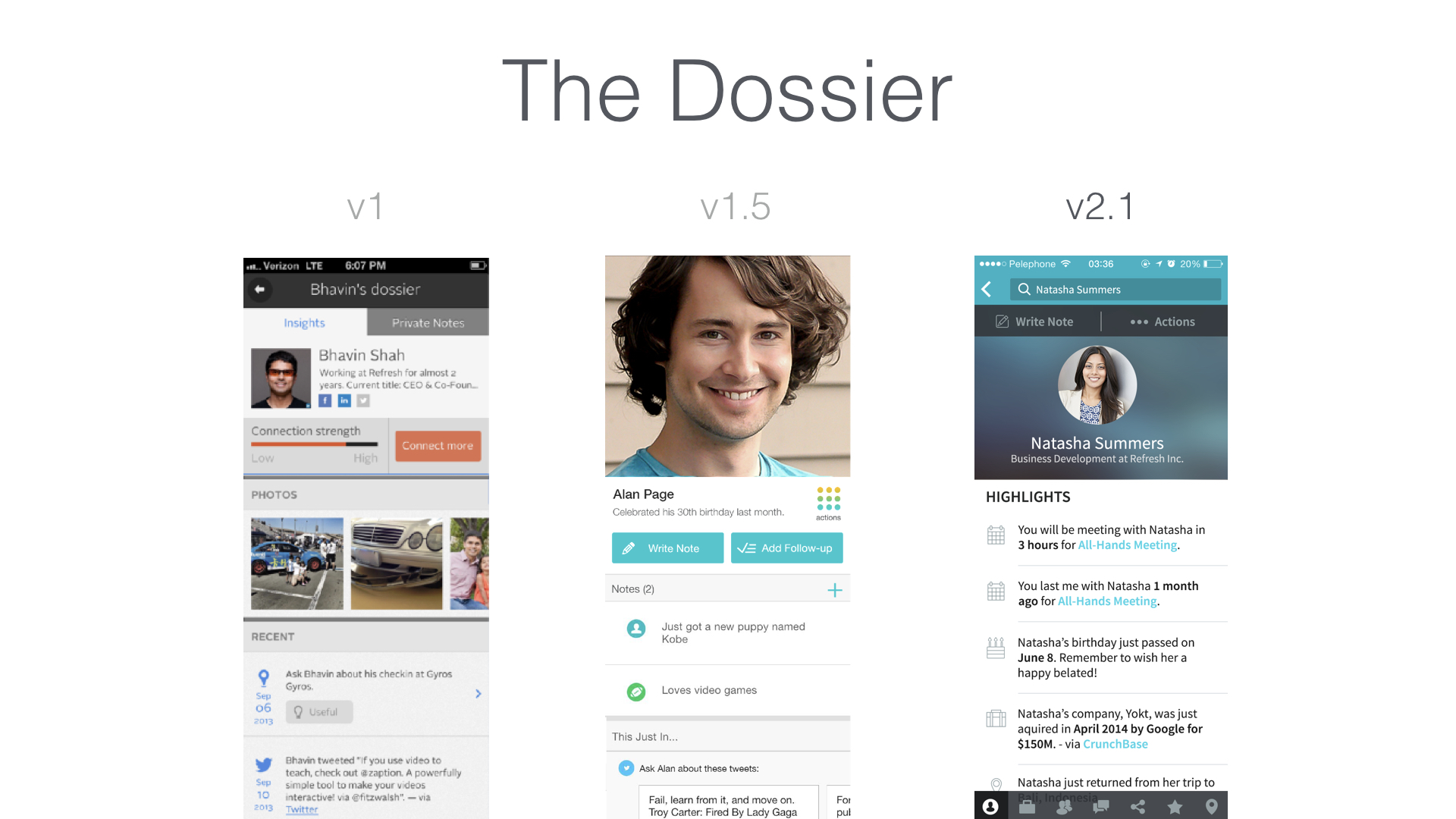
Armed with insights, I was able to brainstorm new concepts and strategies with our team. We began to question the main purpose of each screen and whether there was a way to lay out the content in a more engaging and clear way. For example, in the dossier people were confused about the content they were viewing. They felt too many areas of the app were screaming for their attention and didn't like being told how close they may be to an individual. They also felt they needed more context around who they were viewing and why, even if the person was pulled in from their calendar. Many users were skeptical of providing the app with their passwords and personal data because they didn't find it to the trustworthy. We quickly prioritize the problems and began ideating solutions.
Ideate
Ideating with such an intelligent and passionate team was fun and insightful. We booked a big conference room at one of our VCs offices to sketch, post-it ideas, and paper prototype cool concepts. The developers quickly evaluated the feasibility of the ideas and how long they would take to implement. This process required long days and nights to finish on time, but it was definitely worth it.
Prototype
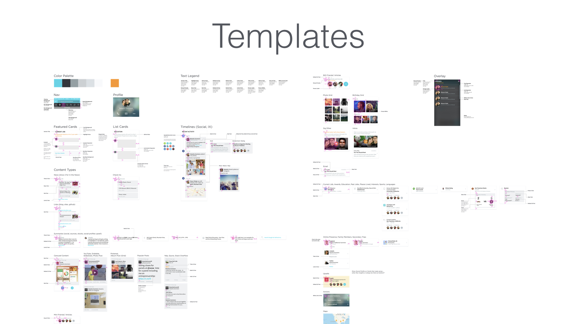
I created detailed wireframes for testing. We explored various interactions and patterns on the low-fidelity mocks before moving to high-fidelity mocks. We continued to refine the design even after specs were delivered due to the compressed timeframes. I would sit with our front-end developers to fine-tune animations and visual elements until we were ready until we absolutely had to release the update.
Test, DELIVER & ITERATE
Given that we had about 1.5 months to deliver our initial redesign and visual update of the initial app experience, we had very little time to do in-depth usability testing. That said, I continued to do Guerilla Usability Testing and seek opinions of family and friends who fit the target demographics to ensure we were on the right path. We reviewed analytics after every improvement to assess its success and areas that need further improvement or research to understand what isn't working.
During our redesign of the dossier (user profile), we did concept validation testing with a set of users who were split between horizontal swiping and vertical scrolling between cards (higher level groupings of insights). There were definitely cases for both: Vertical scrolling allowed the user to scroll quickly through the insights, which it was much better for shorter dossiers that you were viewing on the go. Horizontal scrolling was great for people with a ton of insights, and it was much better when you were trying to find a particular insight. There were also a few technical issues that the horizontal swiping uncovered, which negatively impacted load time and perceived speed of retrieving insights. In the end, after throwing the navigation redesign out to the end users, we learned that it was not the ideal experience for the reasons I described above. After that release, we significantly narrowed down our target market to outbound professionals (particularly salespeople) who would be using the app on-the-go on people they barely know (shorter dossiers).
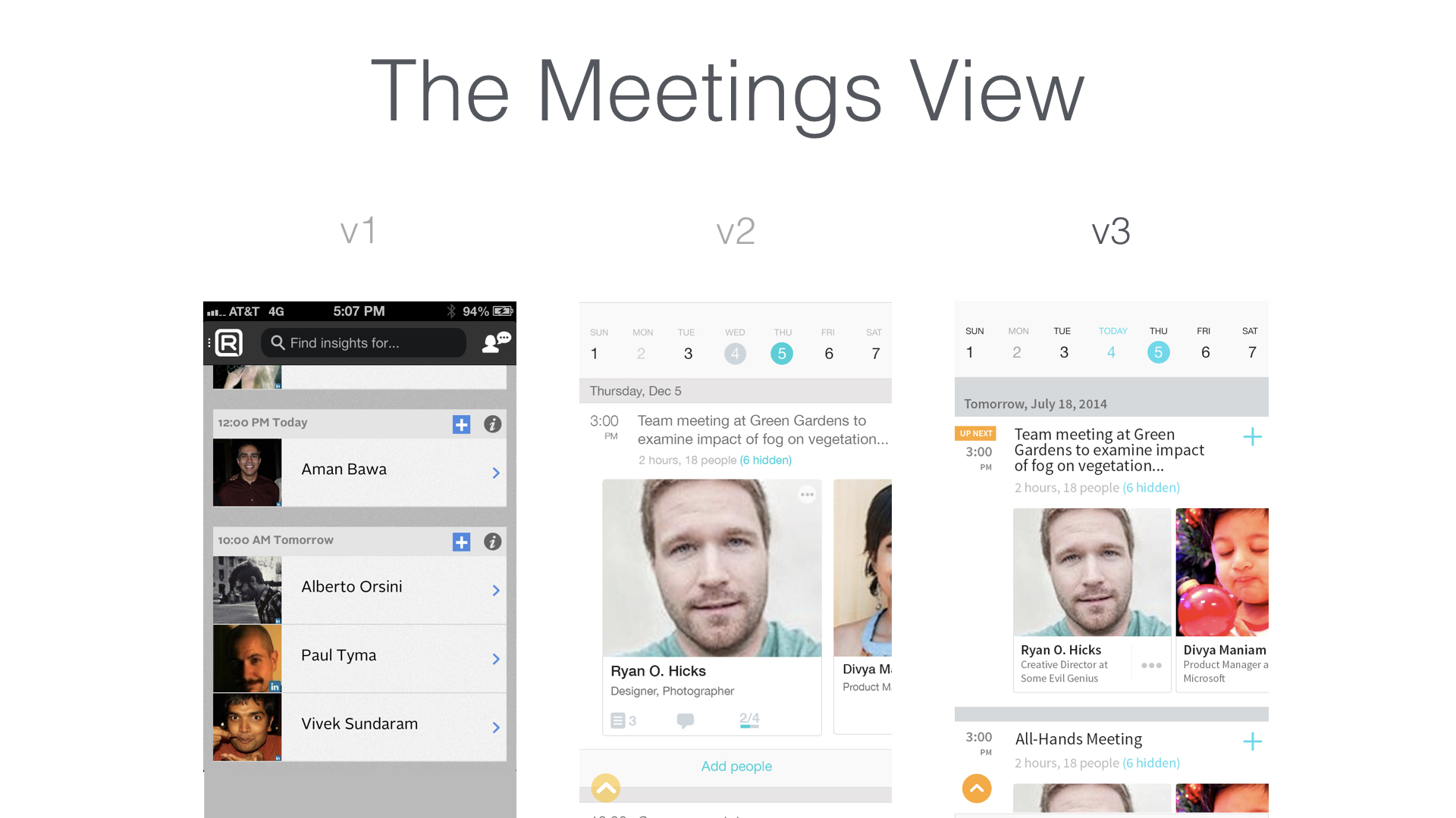
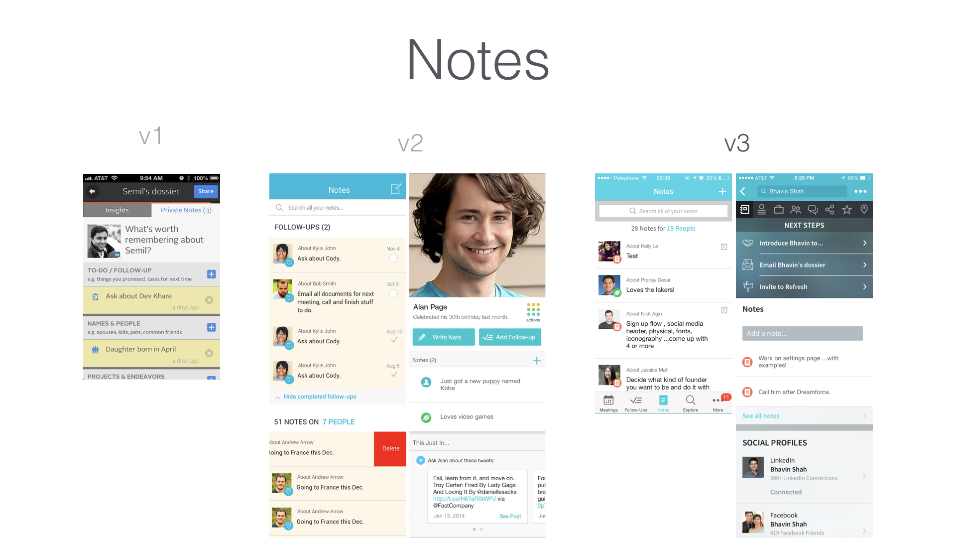
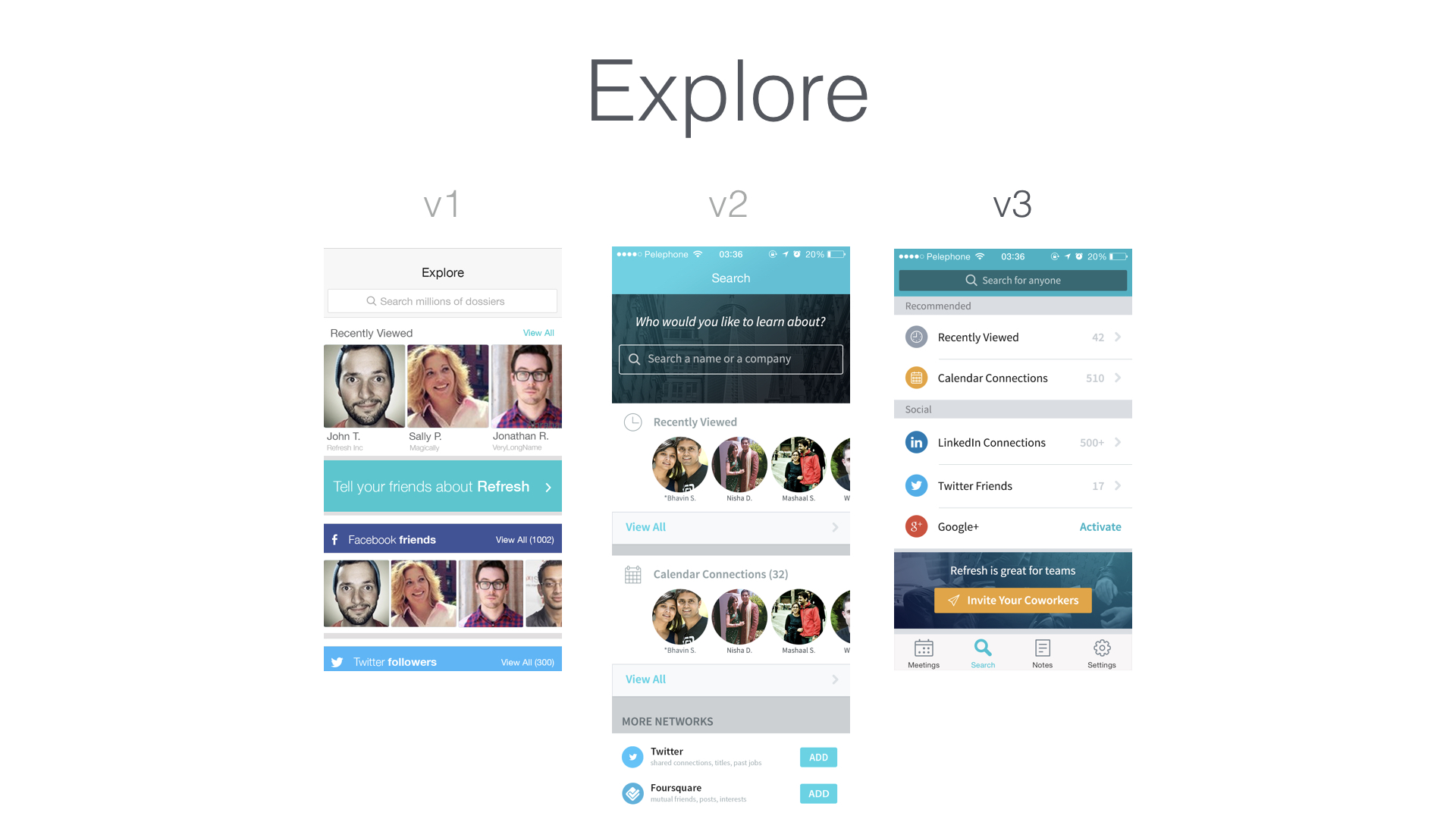
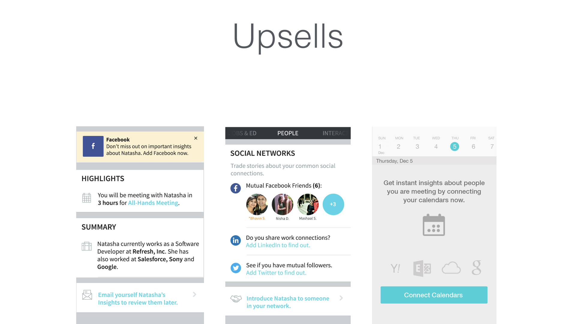
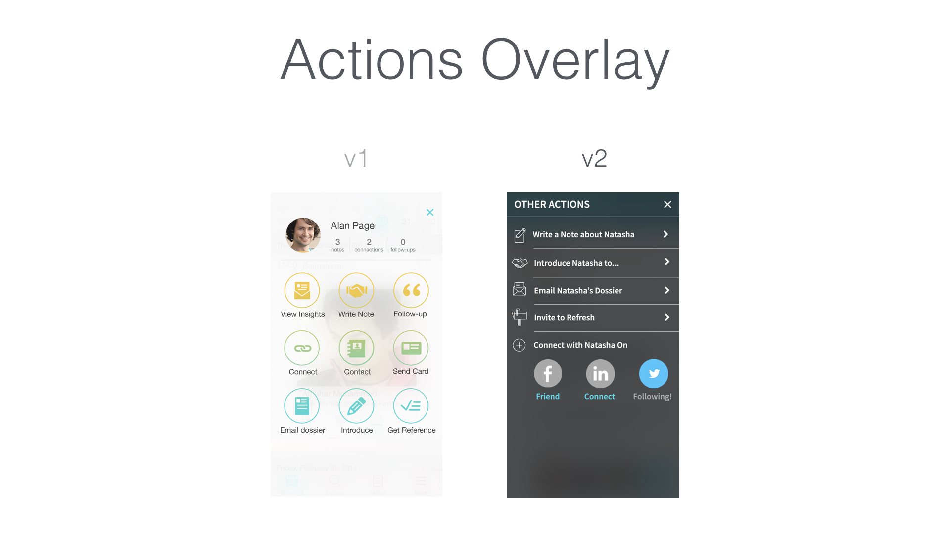
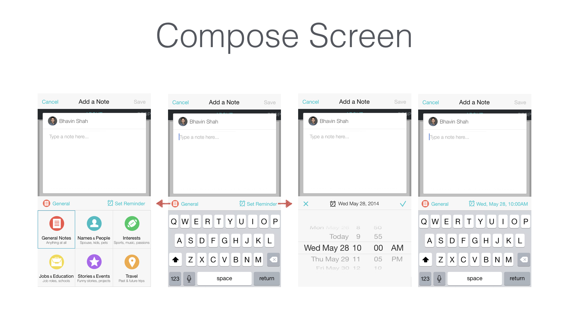
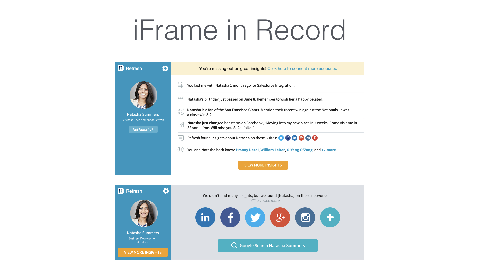
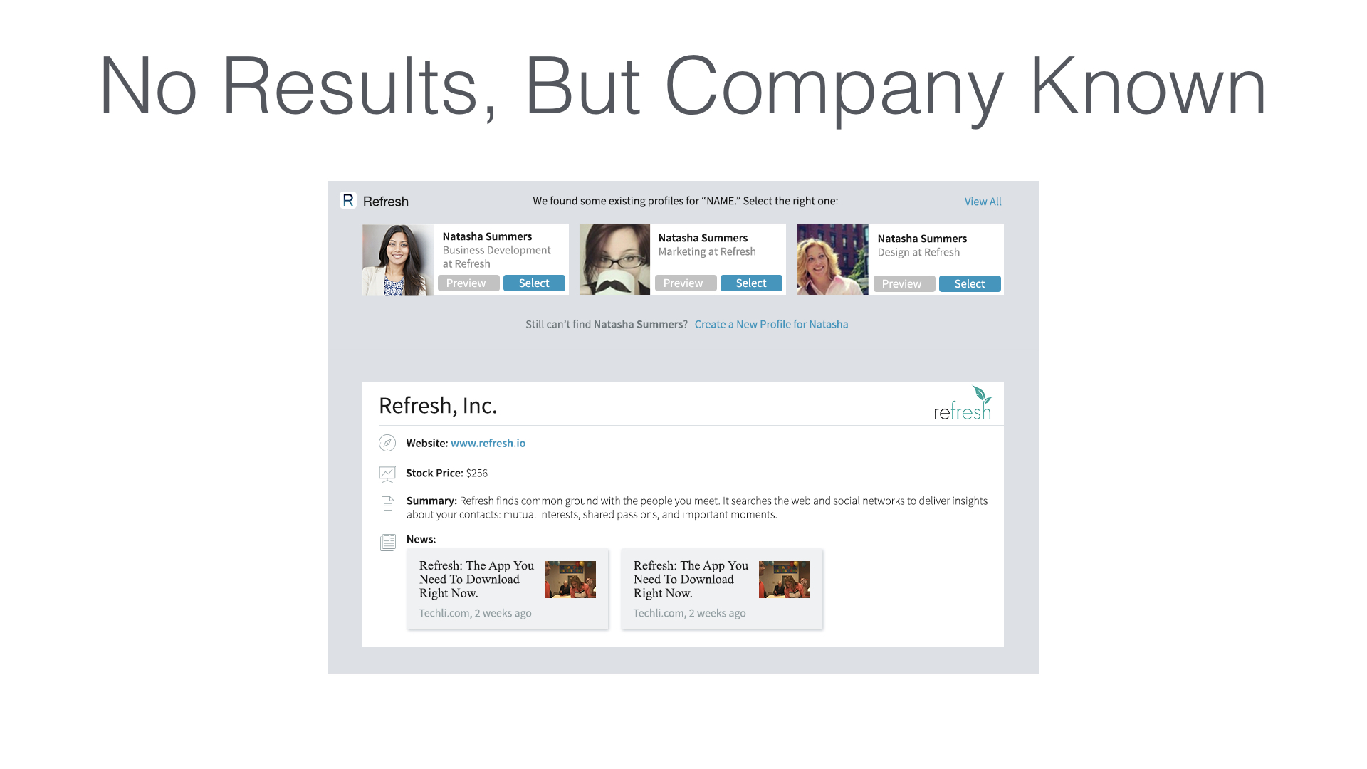
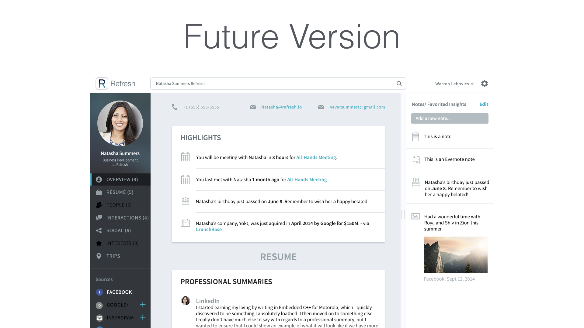
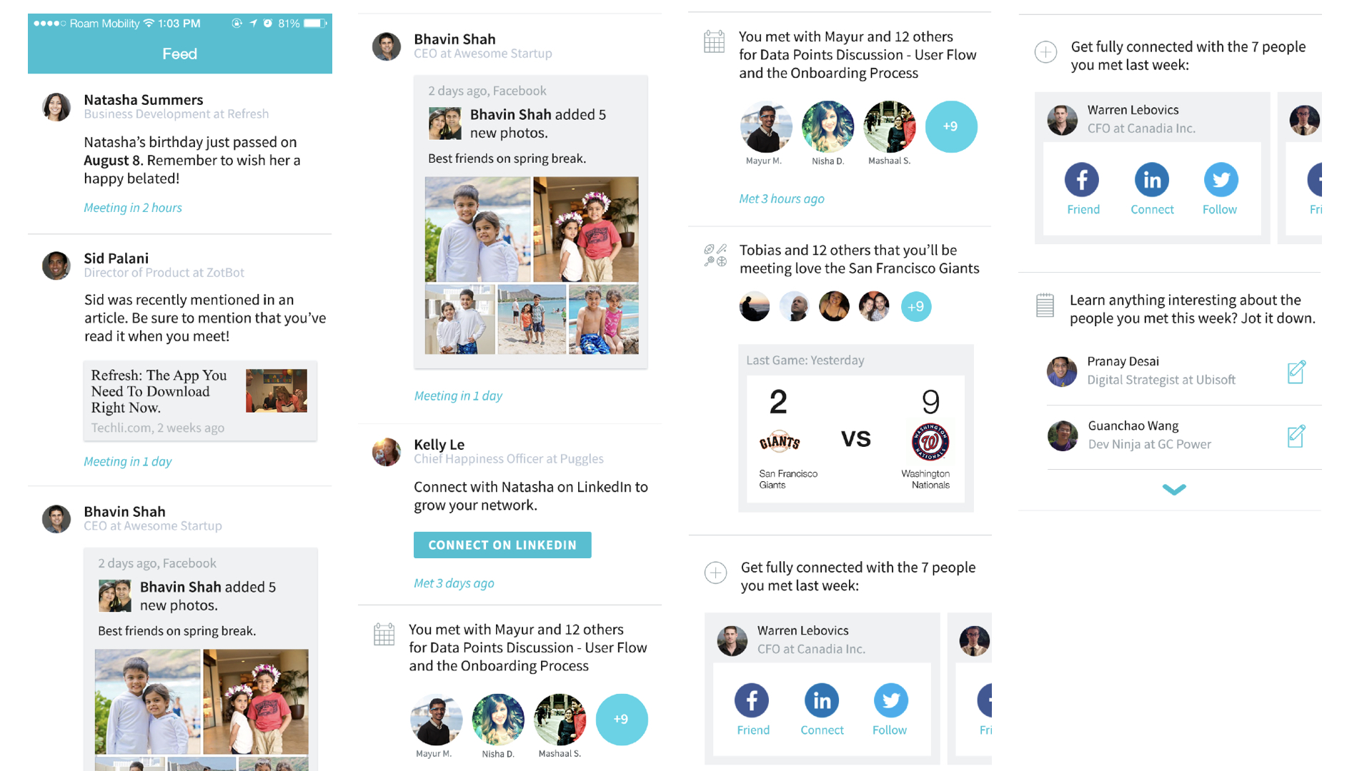
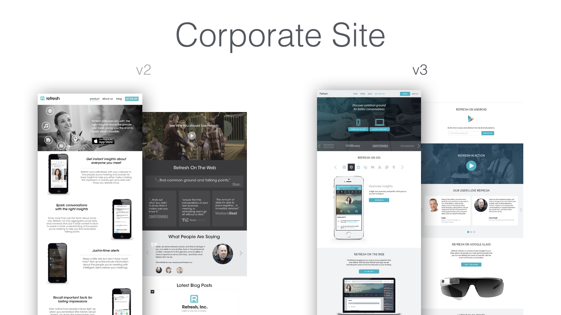
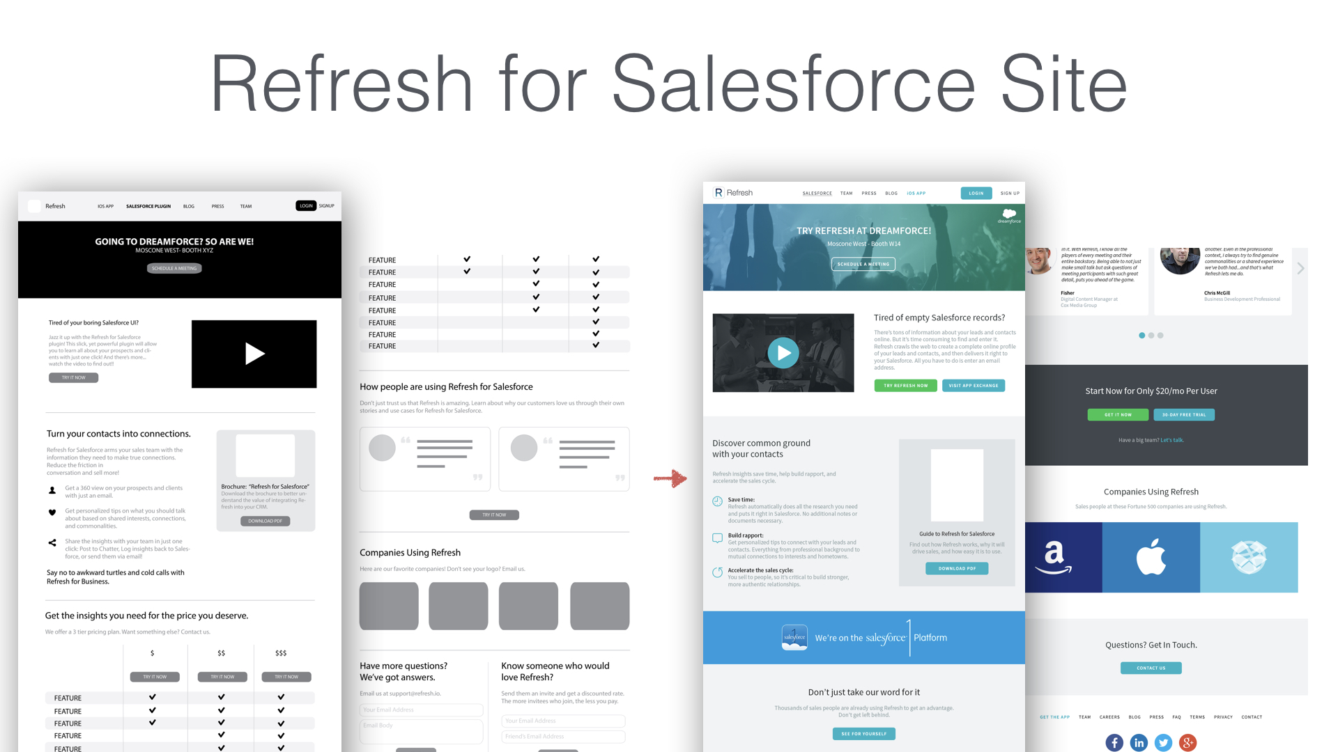
Feel free to swipe through the carrousel below to see how designs evolved on the mobile app, web app, and Salesforce plug-in:
